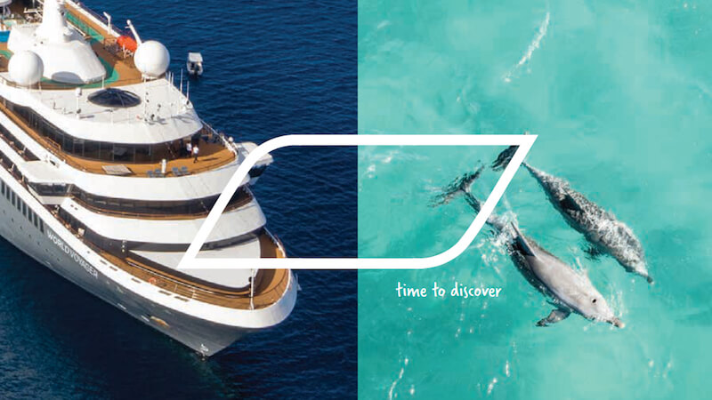
The brand relaunch is being implemented at all levels of communication and finds use in online presentation, on social media and in the brochures.
The colors blue and red in the new logo have been given “more freshness and modernity” with a slight variation, the cruise line said. “Nicko” and “Cruises” will be on the same level and, along with the elimination of the I-dots, ensure “a clear line and more stability,” the cruise line explained.


